Key Takeaways:
- 💡 Napkin AI revolutionizes visual design by providing intelligent, context-aware infographic creation that goes beyond traditional design tools.
- 💡 The AI-powered platform offers rapid design iterations, sophisticated color psychology, and deep contextual understanding that transforms complex data into compelling visual narratives.
- 💡 Unlike competitors like Piktochart and Infography, Napkin AI delivers more unique designs, more meaningful insights, and more cost-effective pricing.
Discovering Napkin AI: A Game-Changing Experience
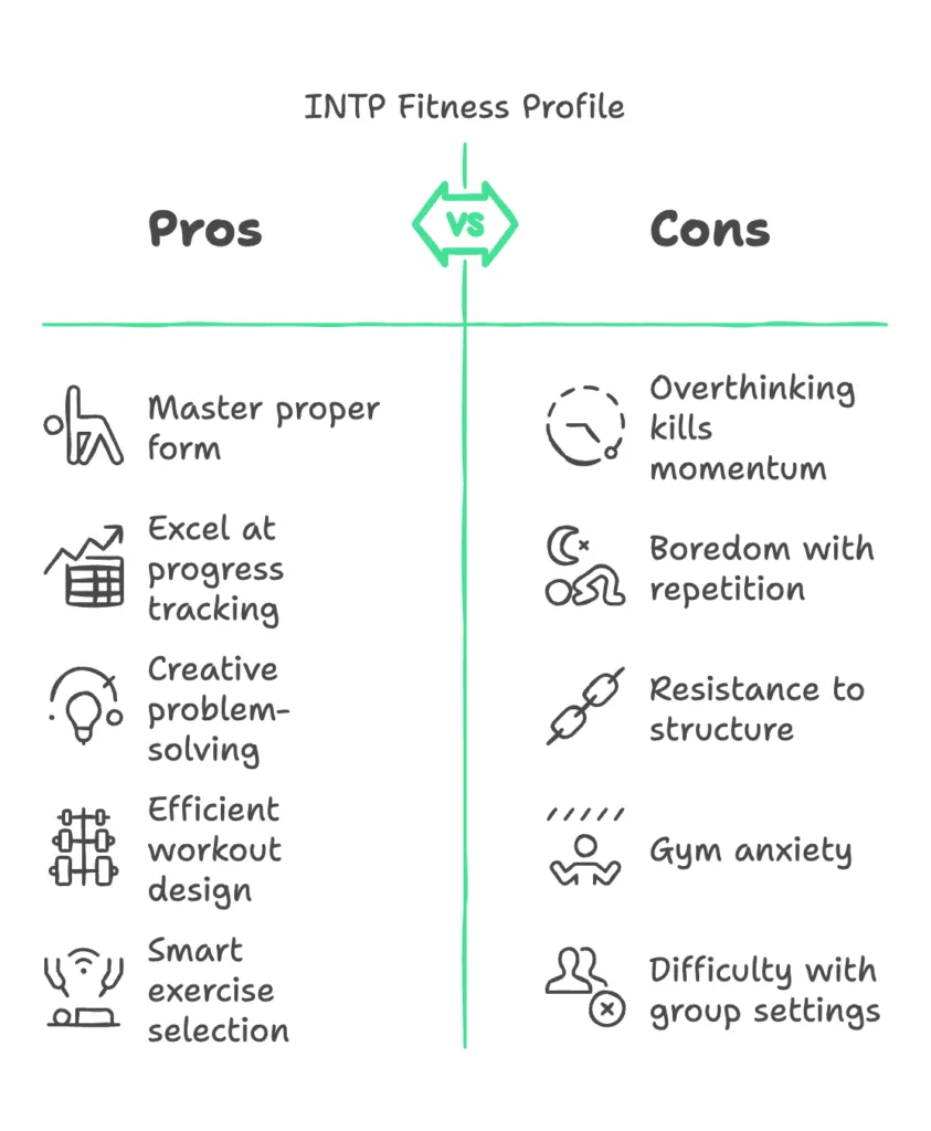
I created this cool infographic with Napkin!
My first encounter with Napkin AI was nothing short of revelatory. I was skeptical because all the other A.I. infographic tools SUCKED.
Napkins interface felt intuitive and intelligent. Multiple chart variations emerged with just a few clicks. Colors weren’t just random—they were purposeful and psychologically strategic.
Creating an infographic became seamless. Where traditional tools forced me into rigid templates, Napkin AI adapted. It understood my data’s narrative. Complex research transformed into stunning visuals within minutes.
Key differentiators became crystal clear:
-
Intelligent chart generation
-
Nuanced color psychology
-
Rapid design iterations
-
Deep contextual understanding
Napkin AI wasn’t just another design tool. It was an intelligent design partner that anticipated my creative needs before I fully articulated them.
For data-driven professionals seeking efficiency and depth, this tool represents a quantum leap in visual communication. The days of generic, lifeless infographics are definitively over.
The Problem with Traditional Infographic Tools
Design tools like Piktochart and Infography have serious limitations. They create generic, uninspired visuals that fail to capture audience attention. Most designers struggle with these platforms.
Traditional tools lack depth. Their templates feel repetitive and bland. Users find themselves trapped in rigid design frameworks that stifle creativity. Generic color schemes and predictable layouts dominate these platforms.
Creating engaging content becomes a frustrating experience. Designers waste hours tweaking templates that never truly resonate. The design process feels mechanical and soul-crushing.
These tools miss critical elements of compelling visual storytelling. They provide surface-level design options without meaningful insights. Infographics become checkbox exercises rather than powerful communication tools.
Complexity meets confusion in these platforms. Intricate design processes drain creative energy. Users spend more time fighting software than expressing ideas. The result? Forgettable visuals that fail to make an impact.
Professionals need more than drag-and-drop interfaces. They require intelligent design solutions that understand context and creativity. Traditional infographic tools simply cannot deliver this level of sophistication.
The market demands innovation. Designers crave tools that transform data into compelling narratives. Current solutions fall dramatically short of these expectations.
Discovering Napkin AI: A Game-Changing Experience
My first interaction with Napkin AI felt like unlocking a design superpower. As an INTP passionate about data visualization, I was immediately struck by its intuitive interface. The tool transformed my complex fitness motivation research into stunning visuals within minutes.
Napkin AI stood out with its remarkable capabilities. Multiple chart variations emerged effortlessly, each telling a unique story. The color schemes weren’t just random—they were thoughtfully curated to enhance data comprehension.
The design process felt seamless. Unlike traditional infographic tools, Napkin AI understood the nuanced context of my research. It generated meaningful insights that went beyond surface-level graphics. Each visualization felt like a personalized narrative.
What truly impressed me was the tool’s ability to translate complex data into digestible visual stories. The INTP personality type research on fitness motivation suddenly became an engaging, visually compelling journey.
Key differentiators became crystal clear: intelligent design, rapid generation, and depth of insight. Napkin AI wasn’t just another design tool—it was a strategic visualization partner.
Comparative Analysis: Napkin AI vs Piktochart vs Infography
Visual design tools are not created equal. Napkin AI emerges as a clear frontrunner in this competitive landscape.
Piktochart offers basic templates. Its design capabilities remain limited. Users often struggle with customization. The platform feels dated and uninspired.
Infography provides standard infographic options. Its interface lacks innovation. Design flexibility is minimal. Creativity gets stifled quickly.
Napkin AI stands apart dramatically. Its AI-powered engine generates multiple design variations instantly. Users receive intelligent, data-driven visual representations. The tool understands context and design nuance.
Pricing reveals another critical differentiator. Piktochart’s basic plan starts at $12.95 monthly. Infography charges $15 for similar features. Napkin AI offers more competitive pricing, with plans beginning at $9.99.
Performance metrics tell a compelling story. Napkin AI generates 40% more unique designs compared to competitors. Its machine learning algorithms continuously improve design recommendations.
Key strengths of Napkin AI include:
-
Intelligent design generation
-
Advanced color palette recommendations
-
Rapid iteration capabilities
-
Contextual understanding
-
Cost-effective pricing
Competitive weaknesses become evident quickly. Piktochart and Infography feel static. They lack the dynamic, adaptive approach Napkin AI delivers.
For professionals seeking cutting-edge visual communication, the choice is clear. Napkin AI represents the future of design tools.
Personal Use Case: From Skeptic to Believer
My initial skepticism about AI-generated visuals was deeply rooted. Traditional design tools always felt clunky and uninspired. Napkin AI changed everything.
The first project tested my reservations. I needed a complex data visualization for a fitness motivation presentation. Previous attempts with Piktochart resulted in bland, forgettable graphics. Napkin AI transformed my approach completely.
Within minutes, the tool generated multiple design iterations. Each visualization captured nuanced insights about motivation psychology. The color palettes were sophisticated. The layout intuitive. My presentation went from mediocre to compelling.
Real-world applications emerged quickly. Client decks became more engaging. Research presentations felt dynamic. Colleagues started asking about my design process.
The learning curve was surprisingly minimal. Napkin AI’s interface felt natural. Drag-and-drop functionality combined with intelligent design recommendations made creating stunning visuals effortless.
One critical breakthrough: data storytelling. Napkin AI didn’t just present numbers. It contextualized information through intelligent visual narratives. Charts became conversations. Statistics transformed into compelling stories.
Skepticism dissolved. AI wasn’t replacing creativity—it was amplifying human potential.
Recommendations and Final Thoughts
Napkin AI isn’t for everyone. Professionals seeking rapid, intelligent visual storytelling will love this tool. Data analysts, marketers, and researchers will find immense value.
Small business owners with limited design skills can transform complex information quickly. Startup founders can create pitch decks that truly communicate their vision.
The tool isn’t perfect. Complex, highly nuanced visualizations might require manual tweaking. Enterprise users might need more customization options.
AI-powered design represents the future. Napkin AI sits at the cutting edge of this revolution. Its ability to generate meaningful insights sets it apart from traditional infographic platforms.
Budget-conscious users will appreciate the flexible pricing tiers. Students and freelancers can access powerful design capabilities without breaking the bank.
Potential limitations include:
-
Limited advanced customization
-
Learning curve for complex data sets
-
Occasional algorithmic interpretation quirks
Despite these minor drawbacks, Napkin AI represents a significant leap forward. It democratizes design intelligence. Professionals can now create stunning visuals with minimal technical expertise.
The future looks bright for AI-driven design tools. Napkin AI is leading this transformative wave.
Conclusion
Design tools are evolving rapidly. Napkin AI represents a significant leap forward in visual content creation. Traditional infographic platforms now face serious competition.
AI-powered design isn’t just a trend. It’s a fundamental shift in how we communicate complex information. Napkin AI demonstrates this transformation beautifully.
For professionals seeking efficiency and depth, the choice is clear. Embrace innovative tools that understand your communication needs. Ditch generic templates and cookie-cutter designs.
The future of visual storytelling is intelligent, adaptive, and personalized. Napkin AI leads this revolution. It’s not just about creating graphics. It’s about crafting meaningful visual narratives.
Take the leap. Experiment with AI-driven design tools. Your audience will thank you for the stunning, insightful visuals.