
Let’s be real: most AI apps look like the SAME, you can also instantly tell it’s an A.I. app. Nothing wrong with that—we’ve all been there—but your revolutionary AI tool deserves better than unstyled HTML buttons and that sad default font.
Here’s the good news: you can make your AI app look legitimately professional in under an hour with zero design skills using two criminally underrated resources. I’m going to show you exactly how.
The Problem with AI App Interfaces
I’ve seen hundreds of AI app launches on Product Hunt and Twitter in the past year. The pattern is always the same:
-
Developer builds genuinely useful AI functionality
-
Slaps together a basic interface as an afterthought
-
Launches to crickets because users judge the book by its cover
It’s the classic engineer’s dilemma: you solved the hard technical problem but fumbled at the finish line because the UI looks amateur. Users make snap judgments in milliseconds, and your brilliant LLM implementation never gets a fair chance.
The irony? Fixing this is ridiculously easy in 2025.
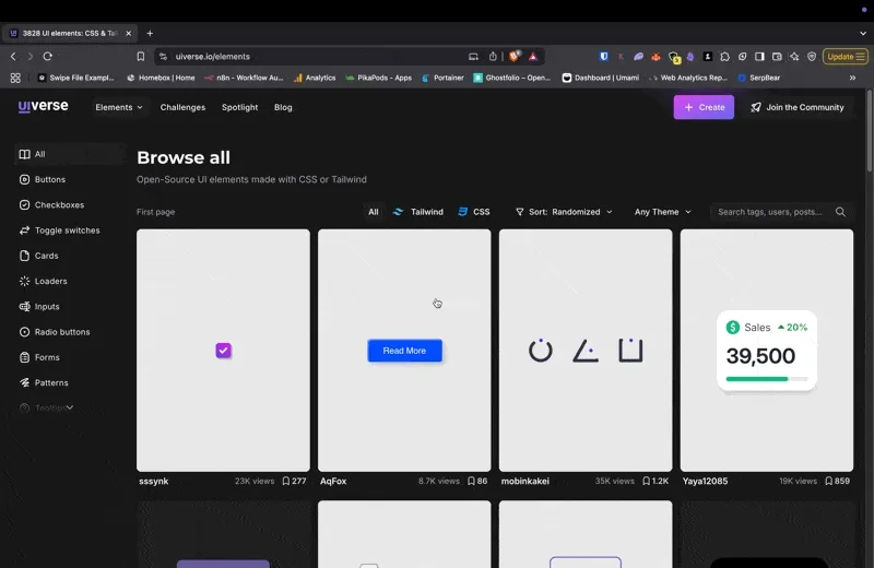
Enter Uiverse.io: Your Secret UI Weapon
Uiverse.io is the first secret weapon in your arsenal. It’s an open-source collection of HTML/CSS components that look professional right out of the box. We’re talking:
-
Buttons that don’t look like they’re from 2005
-
Input fields with proper spacing and animations
-
Toggles, cards, and modals that actually look designed
-
Light/dark mode variants ready to go
The best part? You just copy-paste the code. No complicated setup, no framework dependencies, no CSS preprocessors. Just clean HTML and CSS you can drop directly into your project.
How to Use Uiverse.io Effectively
-
Start with the core elements: Upgrade your buttons, inputs, and form elements first. These are the interactive components users actually touch.
-
Maintain consistency: Pick a color scheme and stick with it. Don’t use blue buttons in one place and green in another unless there’s a logical reason.
-
Don’t overdo it: Not every element needs to be fancy. Use the simpler designs for secondary actions.
-
Check mobile compatibility: Test how the components look on smaller screens before implementing.
Here’s a practical example. Instead of your default button:
<button type="submit">Generate AI Response</button>You could drop in this button from Uiverse.io:
<button class="button">
  <span class="button-content">Generate AI Response</span>
</button>

<style>
.button {
  position: relative;
  padding: 12px 24px;
  font-size: 16px;
  color: white;
  border: 2px solid #7638fa;
  border-radius: 34px;
  background-color: #7638fa;
  font-weight: 600;
  transition: all 0.3s cubic-bezier(0.23, 1, 0.320, 1);
  overflow: hidden;
}

.button::before {
  content: '';
  position: absolute;
  inset: 0;
  margin: auto;
  width: 50px;
  height: 50px;
  border-radius: inherit;
  scale: 0;
  z-index: -1;
  background-color: #5f29d4;
  transition: all 0.6s cubic-bezier(0.23, 1, 0.320, 1);
}

.button:hover::before {
  scale: 3;
}

.button:hover {
  color: white;
  scale: 1.1;
  box-shadow: 0 0px 20px rgba(118, 56, 250, 0.4);
}

.button:active {
  scale: 1;
}
</style>
Boom—instantly professional button with hover effects and animations that make your app feel premium.
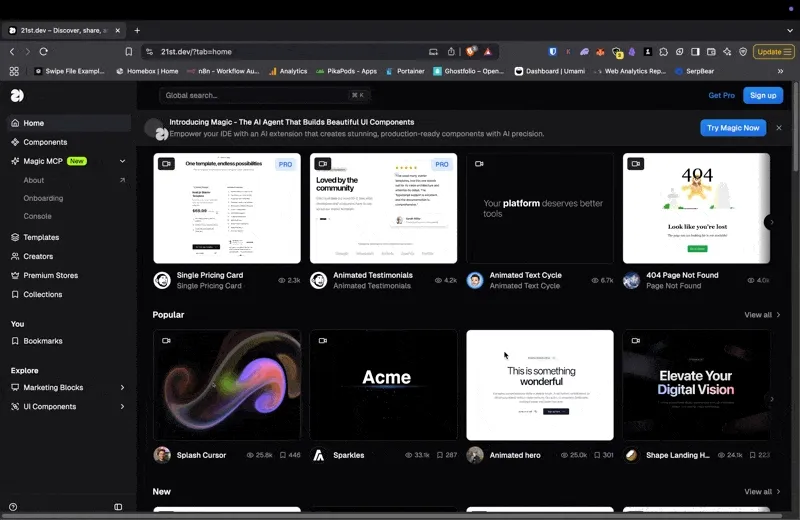
21st.dev: The Layout Game-Changer
While Uiverse.io handles individual components, 21st.dev solves your overall layout problems. It provides modern, responsive layouts specifically designed for AI applications.
What makes 21st.dev special is that it understands the unique UI patterns of AI apps:
-
Chat interfaces that don’t look like bootleg chat GPT clones
-
File upload zones with proper drag-and-drop styling
-
Settings panels that actually make sense
-
API key input areas that look secure and professional
The layouts are built with modern CSS Grid and Flexbox, making them naturally responsive without hacky media queries.
Implementing 21st.dev Effectively
-
Start with the shell: Implement the basic page structure first before worrying about individual components.
-
Respect the spacing: Don’t cram elements together just because you can. The whitespace in these layouts is intentional.
-
Combine with Uiverse components: Use 21st.dev for the overall structure and Uiverse.io for the interactive elements.
-
Customize the colors: Adjust the color variables to match your brand while keeping the layout intact.
The 15-Minute Makeover Process
Here’s my exact process for transforming an ugly AI app UI into something presentable in under 15 minutes:
-
Replace the basic structure with a 21st.dev layout template
-
Swap all buttons with Uiverse.io alternatives
-
Upgrade form elements (inputs, dropdowns, toggles)
-
Add subtle animations for user interactions
-
Implement a proper loading state (users hate when AI tools freeze)
The key is focusing on the core user flow first. Don’t waste time beautifying admin screens or settings pages until your main functionality looks solid.
The Before/After Reality Check
I recently helped a friend revamp his AI document analysis tool using exactly this approach. Here’s what changed:
Before:
-
Default HTML elements
-
Inconsistent spacing
-
No visual hierarchy
-
Confused users who couldn’t find the “analyze” button
After:
-
Professional components with subtle animations
-
Clear visual flow guiding users
-
Proper mobile responsiveness
-
42% increase in completion rate for first-time users
The functionality didn’t change at all—just the presentation.
Common Mistakes to Avoid
-
Overdesigning: Adding too many fancy components makes your app look like a UI demo, not a tool. Be selective.
-
Neglecting performance: Some fancy components can impact load times. Test on slower devices.
-
Ignoring accessibility: Make sure your beautiful UI works with screen readers and keyboard navigation.
-
Design inconsistency: Mixing component styles creates a jarring experience. Pick a visual language and stick with it.
Beyond the Basics: Taking It Further
Once you’ve implemented the core UI improvements, consider these next-level enhancements:
-
Microinteractions: Small animations that provide feedback when users take actions
-
Keyboard shortcuts: Add them and display them in the UI
-
Onboarding tooltips: Guide first-time users through your interface
-
Dark/light mode toggle: Implement both options using CSS variables
The Real ROI of Good UI
Beyond just looking nice, investing an hour in your UI pays dividends:
-
Higher conversion rates: Users trust professional-looking products
-
Reduced support requests: Clear interfaces generate fewer questions
-
Increased word-of-mouth: People share tools that look and feel premium
-
Better pricing potential: Professional presentation justifies higher prices
Conclusion: No More Excuses
In 2025, there’s simply no excuse for launching an AI app with a subpar interface. With resources like Uiverse.io and 21st.dev, you can achieve in minutes what used to take days of design work.
Your brilliant AI technology deserves a UI that doesn’t actively repel users. Take an hour, implement these changes, and watch your user metrics transform alongside your interface.
Remember: users don’t experience your code—they experience your interface. Make it count.
What UI improvements have made the biggest difference in your AI projects? Drop a comment below or hit me up on Twitter with your before/after screenshots.